Clearspan Communications Graphic Design Projects
Clearspan Design Projects
Clearspan™ is an innovative communication and collaboration company that delivers superior client experiences and operational efficiency at scale. After working together previously (tied into my position with Sangoma), I have had the opportunity to help Clearspan out on a number of projects. Highlighted below are three recent jobs I have completed.
The Projects
Originally built as a low-resolution flat PNG from Canva, Clearspan had a design in mind for a high-visibility, large-scale printed banner stand graphic. This graphic needed to be sent to the printer within two weeks to be able to make sure it could be used at upcoming trade show events. I recreated the layout in Illustrator, designing it so it was scalable and to the printer’s specs. Upon completion, this project was provided as a printable PDF as well as an editable AI so that the company could access it if needed in the future, ensuring they would not need to have it rebuilt again. The banner stand was successfully sent to print and has since been featured at a number of trade show events.
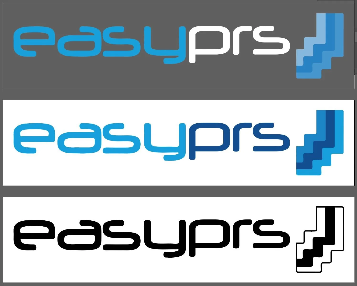
Provided with a current product logo (OpEasy), a set of keywords and product information, and a new name, Clearspan wanted a logo for their new product EasyPRS. First, I focused on matching the typography of the OpEasy logo. This was a case where the font was a slight derivative of the core, but I was able to accommodate those differences without compromising the outlines. After the logo text was solved, I developed a few options for the icon that would appear to the right of the product name. After feedback, I finalized the EasyPRS logo and provided a variety of file types to simplify future uses the company might have. As with any logos I produce, I included vector and PNG art of the logos in three color palettes - the brand’s blue colors for use on white backgrounds, a mixture of white and blue for dark backgrounds, and a one-color black version of the logo for single-color prints and usage.
Within the user interface of one of Clearspan’s products, they were experiencing a fuzzy, low-quality image in the header. Faced with needing to inform customers about upcoming changes, I worked with Clearspan to recreate this flat file in a high-resolution Adobe file that would include their new information. Working with a screenshot for sizing and the brand guidelines, I laid out the interface banner using the original as a basis, focusing on improving the quality of each piece. Once approved, this banner improved customer awareness, experience within the product, and general readability, all of which reflect positively for Clearspan with its customers.
The Outcome
As a frequent client, Clearspan continues to choose to work with Emerald Blythe Design. They know the quality of work, communication, and thoroughness that I guarantee will ensure their design needs are handled with the utmost care and respect.
Kayla Swanson, Channel Marketing Manager at Clearspan, said,
“Quotey quote quote”


